Hey, so last month I released an animation with music behind it. You can watch it here:
This is one of the first attempts of mine to make something with a less upbeat tone. It's also the first complete animation that I made in Blender, and also my first complete attempt to compose something that is only driven by a piano.
What I wanted to convey with the video was the feeling of standing near an urban road just before sunrise during the winter. This depiction comes close but not as well as I would have hoped, both because of my current level of skill in Blender and music composition, and because of me sitting on things and rushing them later on.
One day I might redo this video and make a better version of it. But for now, I'll describe what I did while making this.
Blender 🔗
Blender is a beast. Sure, there is an initial learning curve but once you do get a grasp of it, a large number of doors open up to you: Blender can be your video editor, your 3D modelling program, 3D animation program, and even a 2D animation and drawing program! The learning curve also decreased somewhat for a beginner after the addition of more intuitive UI elements on the viewport after Blender 2.8.
Technical Obstacles 🔗
The only major problem comes to you if you are running Blender on a potato (like me, for example.) Blender puts on quite a bit of load when you are working with a large number of objects in your project, and not having enough RAM and a good graphics card to compensate for it really does put a damper on your activities.
I'll explain more how this has been an issue later in this article.
Designing the Setting 🔗
LIke I said above, I wanted to capture a certain calm or somber feeling, maybe like the feeling that you might get when you get up very early in the morning to catch a bus or a train and then standing and waiting it to arrive. To emulate that, I decided to make a scene of a sidewalk, with a row of street lights and a house on the side. The scene has a thick morning fog and a slight sprinkle of snow to set the mood properly. Instead of the house it could have been a wall, a row of shops or something that fits the setting more. I felt like that got into somewhat too ambitious territory, which would have probably eventually looked out of place or too uncanny in this scenario at my current skill level.
Placing and Editing Objects 🔗
From what I have gathered from most of the Blender tutorials that I have seen, its that most 3D models of things are simply made out of cubes, cylinders, planes and other basic objects by joining them together, transforming them or applying the various modifiers that Blender has.
To start with, let's talk about the ground that we see in this scene. It's just a large rectangle that lies flat along the XY-Plane of the 3D space (this rectangle is called a "plane" object.) To create the elevated platform of the sidewalk, I decided to cut the rectangle somewhat diagonally, and lower the new face that had been created. I did this using the knife tool, and then performed the extrude operation on the newly created face.
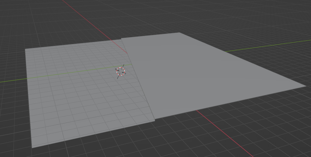
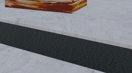
3 New faces are created because of the extrude operation which I just deleted off. Now for the road. It's just another plane.
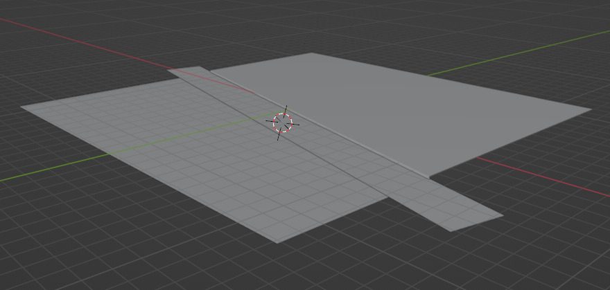
Of course, they're not textured and you can see that it's not really a proper sidewalk with proper concrete dividers and drains and all that, but we'll be hiding taking care of that later.
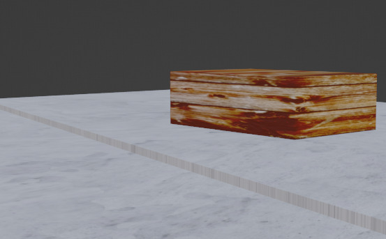
Now for the house. It's a box. Literally.
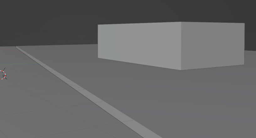
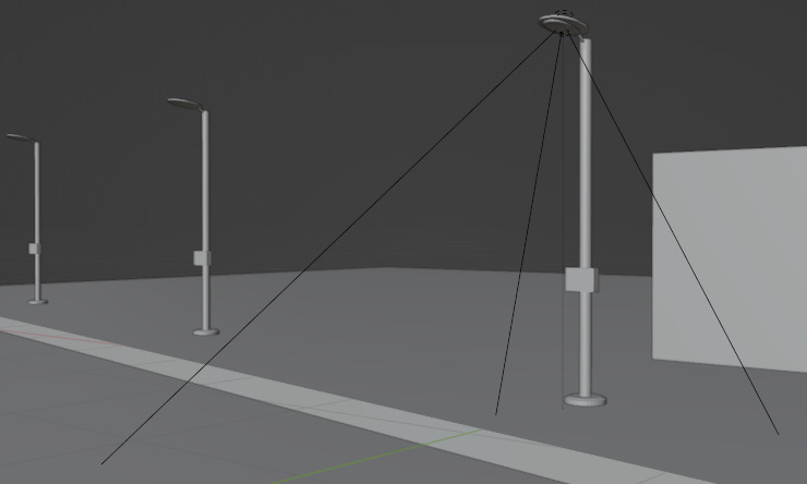
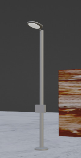
Finally (lol), the lamp post. this is the most complex object in the scene. We will be using modifiers over here.
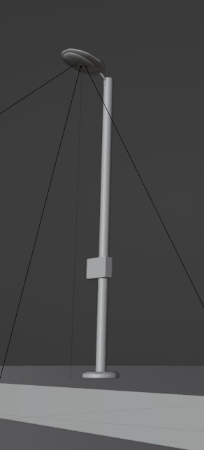
This is a combination of 3 cylinders and 3 boxes. One cylinder is used as the base of the lamppost. the other is the post itself, and the third one is the one that connects the bulb holder to the lamp. The oval-shaped lightbulb holder thing was created heavily bevelling two boxes. Bevelling is usually just usef for smoothing out or cutting slant corners/edges out of an object, but if you screw with the settings enough you can make shapes like this. The remaining box is the fusebox in the lower middle. Finally I used the array modifier to create a series of lamps.
Applying materials to objects 🔗
To apply any sort of cosmetic changes to these objects, we need to apply materials to them. Materials are where complexity would really start to rise when you go beyond their basic usage.
Once you add a material to some object, you'll be greeted with a menu that looks like this:
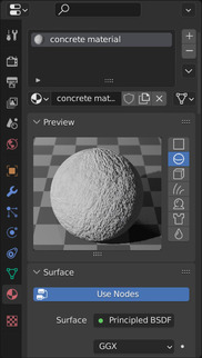
Here you get options for selecting a color, some other weird options at first glance like "specular" or "metallic" and so on. All of these options affect how the object looks in the 3D rendered space.
However, this is only a small part of what Blender has to offer in terms of creating a material or shader. What you get to see on the above scene is actually just a view of a single node object of a network of nodes that may make up the material.
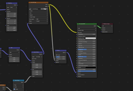
If you have ever written OpenGL shaders, you may find the way materials are created here are familiar to you. Instead of making you write code, Blender makes you create materials using nodes that perform certain functions, and connecting them together. You may find this easier or harder to do depending on how well you are able to think in terms of nodes instead of code.
The Concrete Floor 🔗
This is the most complex out of all of the materials used in this scene, and for a single reason: tiling a pattern seamlessly. The screenshot below is the concrete texture. You probably can't notice any sort of tiling patterns or major blurriness on the surface. That's because of some node editor magic.
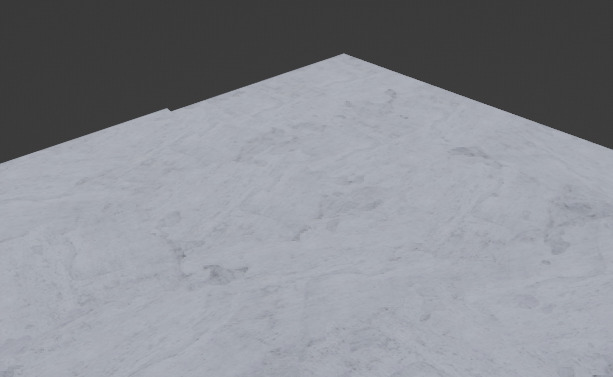
If you were to just apply the image to the object, it would have looked blown out and blurry because Blender, by defualt, stretches the whole image across the object. Storing an extremely large texture isn't something that is ideal. Something we can do to fix that is tile the texture across the surface. Which we can do by scaling the texture coordinate out so that it repeats multiple times over the object. The number of times it will repeat depends on the scale factor.

Though the blurriness is gone, it still doesn't look too good.
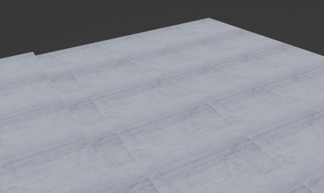
This was ultimately solved by someone else's seamless tiling solution. This one is by the Youtuber XYZ who graciously provided the node set for free over here. Go check it out. INSERT LINK HERE. What this essentially does is that is randomly creates texture boundaries for each repeating tile, and then rotates them by a random amount. This gets rid of the repeating tile look of the floor. This isn't appropriate for all types of textures, but it's good enough for this.
The House 🔗
Not much to say here. I just used a wooden floorboard texture and applied it to the box and hoped that the fog would hide it well. I think the fog did it's job well in the end.
The Road 🔗
The road uses a few of the generated texture features in Blender to create the asphalt look. It doesn't look great but it's passable.
Lamp Post 🔗
The Lamppost actually uses 2 materials, one for the body, and the other for the bulb housing. The body is just a grey color, and the bulb housing is white with the emission attribute turned up. The emission attribute allows an object to be visible even in the abscence of light, but as far as I know it does not radiate light or at least in a noticeable amount.
The Fog 🔗
This is one of the more interesting parts of the scene. Fog in Blender is usually impelented as an object, rather than as a postprocessing effect that may be available in game engines (there may be options for such "object fog" in game engines or postprocessing fog in Blender but I am not entirely sure.)
Blender actually has 2 classes of shaders that affect different parts of the object: one is the surface shader (most shaders, like the ones above are surface shaders,) and the other is the volume shaders, that affect the volume of the object rather than the surface, so if you were inside the object you would actually be able to observe this shader, rather than maybe seeing it only on the walls of the object.
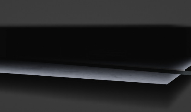
Here's what the fog looks like outside the scene. It's a box that stretches across the entire ground with the fog material added to it.
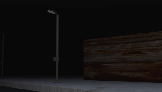
And this is the inside:
Up till now, we were only looking at this using the texture view. Let's switch to the actual rendering view now.
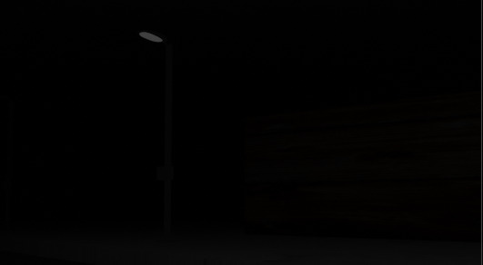
Pretty dark, isn't it? The only thing we can make out here is the light bulb which we had applied the emmision property to. The next section will fix that for us.
Lighting 🔗
This is the final part to make the scene complete. Of course, there needs to be a light for our lamppost, but we will also need a global light on the scene to increase its brightness within the fog, and also prevent it from showing the deformities that are present in the rest of the scene by hiding them with the fog.
I've added an area light which illuminates the part of the scene that I want to show, and added a spolight to the lamp. Both are objects (without surfaces) in Blender. Here's the scene wih lighting:
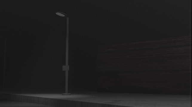
There's our thumbnail.
Normal Maps 🔗
The concrete still looks pretty "awkward" doesn't it? Maybe it's due to the flatness, maybe it's because of something else. One thing we can do to make this better is to make the concrete look "rougher." Currently the concrete looks like if we just stuck a picture of concrete on the floor and concrete on the floor and called it a day (which is exactly what we did :)).
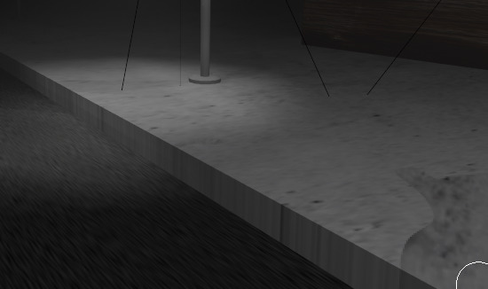
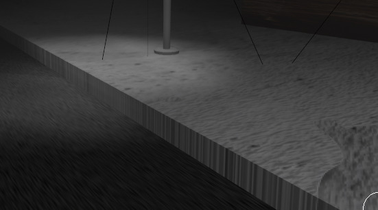
We actually have a feature that will make the light falling on it dynamically interact with the cracks, bumps, and crevices the concrete has, and this is called Normal Mapping. Blender has a material node called bump. Bump takes the texture that we are applying on the surface of the object, generates a "heat map" diagram from it based on assumptions of height and depth, and passes it to the normal map input of out Surface BSDF node. The normal map then alters the effect of the light falling on it by reducing or increasing the brightness as needed.
Here's the final result:
The Animation 🔗
We've finally come to the animation part. Well. as you might be able to tell from the video, there's not much I am doing here aside from shaking the camera around a bit, but I've neglected to talk about another thing that is probably obvious by now, which is the snow.
The Particle Generator 🔗
The way blender can create sprinkles, powder rain, snow or anything else is typically with the use of a particle generator. Any object can be turned into a particle generator with a setting in an object's options menu.
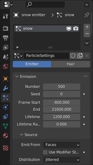
In my case, I created a disc-like plane (using the circle object above the scene and then created another small circle object, that would act as our snow particle. Then I fiddled with the settings until I got the type of snowfall I wanted. Not much more than a light trickle.
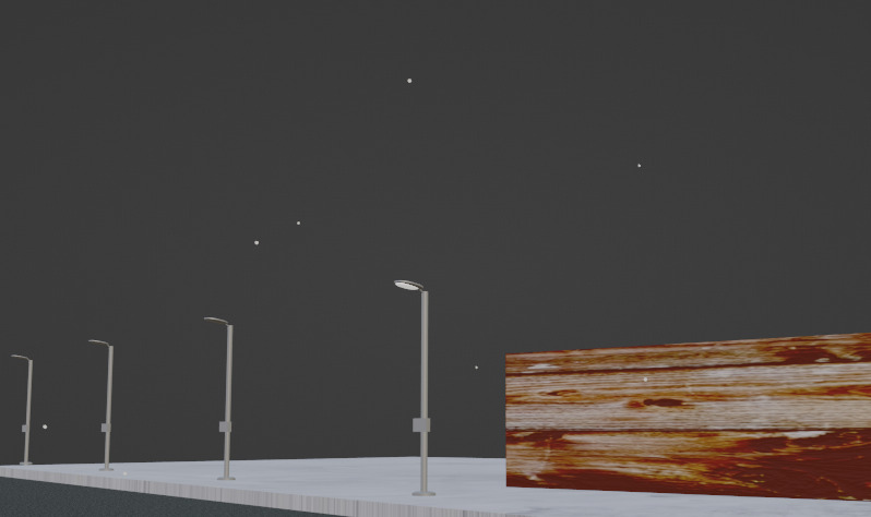
A side note about the material used on the snow particle. I had to turn down the specular so that the they did not shine when light fell on them.
And that's the whole scene!
Music 🔗
Let's now talk about the other half of the video: the music. It's certainly different from what I've put up on the channel till now: abstract techno-ish music. I have tried to use real instruments before as soundfonts/samples in previous attempts at composition before, but they usually end up sounding awkward many of the times, but I have managed to make it work to some extent, especially when using them as minor instruments in a primarily synth based song.
Real drum samples have always blended well with synth based somgs for me, as you might be able to see in the previous two songs on the youtube channel, but this is probably a very common technique.
Composing 🔗
As before, since I have no idea what music theory is, I'll try to make as much sense as possible with normal English.
Before I start, let me quickly explain what an octave is. An octave is a series of notes that sound the "same", but "differ" in pitch. Listen to this to understand what I mean:
What you heard was 2 octaves. You might have noticed that the first series of notes sounded similar to the second one, but differed in pitch. Each octave consists of 7 notes. There are 4 more notes that exist between these 7 notes which are commonly used in music. Together they are called semitones. There are a total of 12 semitones in an octave (8 + 4)
Usually, they're shown with the following notation:
C C# D D# E F F# G G# A A# B
The notes marked with the "#" are called "sharp" notes. As to why they are written this way I have no idea, but this is the most common notation you will find in conventional music programs/digital audio workstations (DAWs). There are also a dozen other notation systems that I don't know and don't care about, but people do use them. Usually in DAWS, they are also suffixed with a number which specifies the octave the note is being played in, so they may look like `C#5, D5, E4, G#4` and so on. Here's a video visualizing all of the notes in an octave:
If you listen to piano compositions or watch videos on someone playing them, or one of those MIDI player videos (like this synthesia one), you will notice that there are two or parts in the composition, some played at a higher octaves and others played at lower octaves. The high octave and the low octave notes being played interact and complement each other to create something that sounds more complex than themselves. Oftentimes, people might also play 2 or more notes from the same octave together to produce the same sort of effect of creating a more complex sound.
I would go as far as to say that these two basic concepts of note combination are the fundamental building blocks of creating any sort of music composition and are used in virtually all pieces of music. Yeah, I'm probably reinventing the wheel here a thousand times over, but its kind of fun to learn and realize things this way and then write those thoughts on paper in my own words. Also, I can't be arsed to drag myself through a textbook or an online music theory course or whatever.
The End Product 🔗
Getting on to what I ended up putting in the video, well, It was less than satisfactory. I tried to use my past experience in creating such note combinations that sounded good along with the verbalized realization of the above "principles." There are quite a few sections of the song that I was surprised that I was able to think of and compose, but overall I think it faltered in the actual variation of interesting patterns in the music, and ended up sounding somewhat rushed after the middle of the song.
What really botched the song was the reverb that I was trying to add to the instruments to "flesh" them out a bit more. What ended up happening was that I kept tweaking it until it just sounded like a combination of muffled and ear-splitting. Unfortunately I just put that in the video because it sounded fine to me at the time.
It sucks, but nonetheless there were a few good things that I learned from it, so hopefully it will be worth it in the long run.
Wrong tools? 🔗
LMMS and OpenMPT are great projects and can be used to competently produce music, maybe even in professional environments to some extent, but no current open source/freeware project is able to compete with any professional level DAW available. Be it FL Studio, Abelton Live, or anything else, unlike with the 3D CGI scene with Blender.
LMMS's interface really needs some serious UI overhaul before it can start competing with the likes of FL Studio. From what I have seen in the FL Studio demo, LMMS simply does not have the versatility and flexibility that FL Studio has in terms of moving segments of the project around, zooming and scrolling the pattern view, the ability to put things into separate windows and other numerous features.
It'll be quite some time before a really mainstream open source DAW comes around. I do know about Ardour and it does look like there was a lot of work put into it, but couldn't really test it out because I haven't had much luck configuring JACK on my system. It seems like whenever I try to configure an installation of JACK on any system, it just decides to break on some random day on a reboot or on a system package upgrade. Granted, these are all Ubuntu/Debian systems so that may be the problem. I have had luck with Cadence in the past before so you might want to check that out.
Maybe I'll consider shelling out money for them someday.
As for the song itself, it isn't really much of LMMS's fault, but maybe having a more convenient interface for trying out plugins one by one or a more convenient interface in general would have helped? I don't know.
Rendering to a video (and Other Gripes) 🔗
Rambling 🔗
(Please skip over to the next section if you don't want to read this)
Here's the main problem when attempting to do anything like this. Unlike programming, activities like 3D CGI, Music Production or electronics or anything that has a physical output, producing professional quality content with good efficiency requires you to have money. To create complex animations in Blender using Cycles rather than Evee/Blender Render on an Intel i3 is a laughably grueling task that's really not worth your time. Similarly for Music, you have to spend, at the very least, a significant amount of money on a DAW and a few plugins to create professional quality music and have an efficient audio editor (though that bar has lowered quite a bit in recent times), and at the same time have a decent enough PC to handle the load that comes from a fairly complex project (this happens even on using something free like LMMS or OpenMPT).
It's possible to do all of this without spending any money, but you trade money for your mental energy and your time. Sure, it's possible to not just buy a PC that's better than a potato and make 3D animations on that, but then you limit yourself to using something like a game engine, and writing an extension for that game engine to render out the frames at a constant framerate from it to have any level of efficiency in your work. But even then, you might not be able to create animations that have the same level of detail or fineness than if you were to create it in Blender. Proper hair simulations would probably be a nightmare to do in something like Godot/code from scratch.
Now with the current rise of AI and AI based content, it is increasingly becoming a necessity to have a decent graphics card for a hobbyist to actually screw around with the tools that are currently available like DALL-E Mini and Stable Diffusion. It's really a hard barrier between the people that have good GPUs and do not have good GPUs.
The Main Part 🔗
Let's take this animation for example, This is an Evee animation rendered in a resolution of 640x360 at 60 frames per second. It's about a 6 minutes in length and each frame took about 1 second to render on my computer, so if we do the math:
6 Minutes = 60 * 6 seconds

Total Frames in a second = 60

So, Total Frames = 60 * 60 * 6 frames

So, Total time taken = 60 * 60 * 6 * 1 seconds
                     = 6 hours
And that's not counting the times when Blender just randomly crashed during the rendering period, wasting all that time when leaving it out overnight because I rendered it as a video (If you can spare the disk space, never render as a video, by the way). I also had previous renders where I had a higher resolution than this, and realizing in the morning that they were only halfway done after leaving it overnight. There were also errors that I only noticed when I looked at the rendered animation, so I had to waste 6 hours or rendering once again.
Eventually, it was done and the final product was, predictably, underwhelming, Maybe the low resolution of the video adds something to it, but more could have been done if I had more time, probably.
Final Thoughts 🔗
This project did confirm and bring up a lot of the shortcomings and the hard "barriers" that I have. I knew of most of these problems even before I started this project, but going through it confirmed that this is not exactly a realistic way of doing things going forward if I want to have and keep having a high output rate. I can keep my current resources and tools and keep working with them, but that does drastically reduce the scope and efficiency with which I can do things. I will have to make a few adjustments in my workflow if I want doing things to be less of a pain.
On the bright side, I'm getting the hang of Blender more and more as well as combining music notes. In the future I'll try to create a midi/libopenmpt python library for Blender for creating keyframes. Maybe we can do some cool stuff with that.
Right now I'm trying to focus on getting an update for StretcherDrill out by the end of January, since I've been neglecting it for such a long period of time. It's actually coming along somewhat better than I expected, so this is probably something to look forward to!
Anyways, see you in 2 weeks!
